Wave sport
Product Concept Page.
Sport and style.
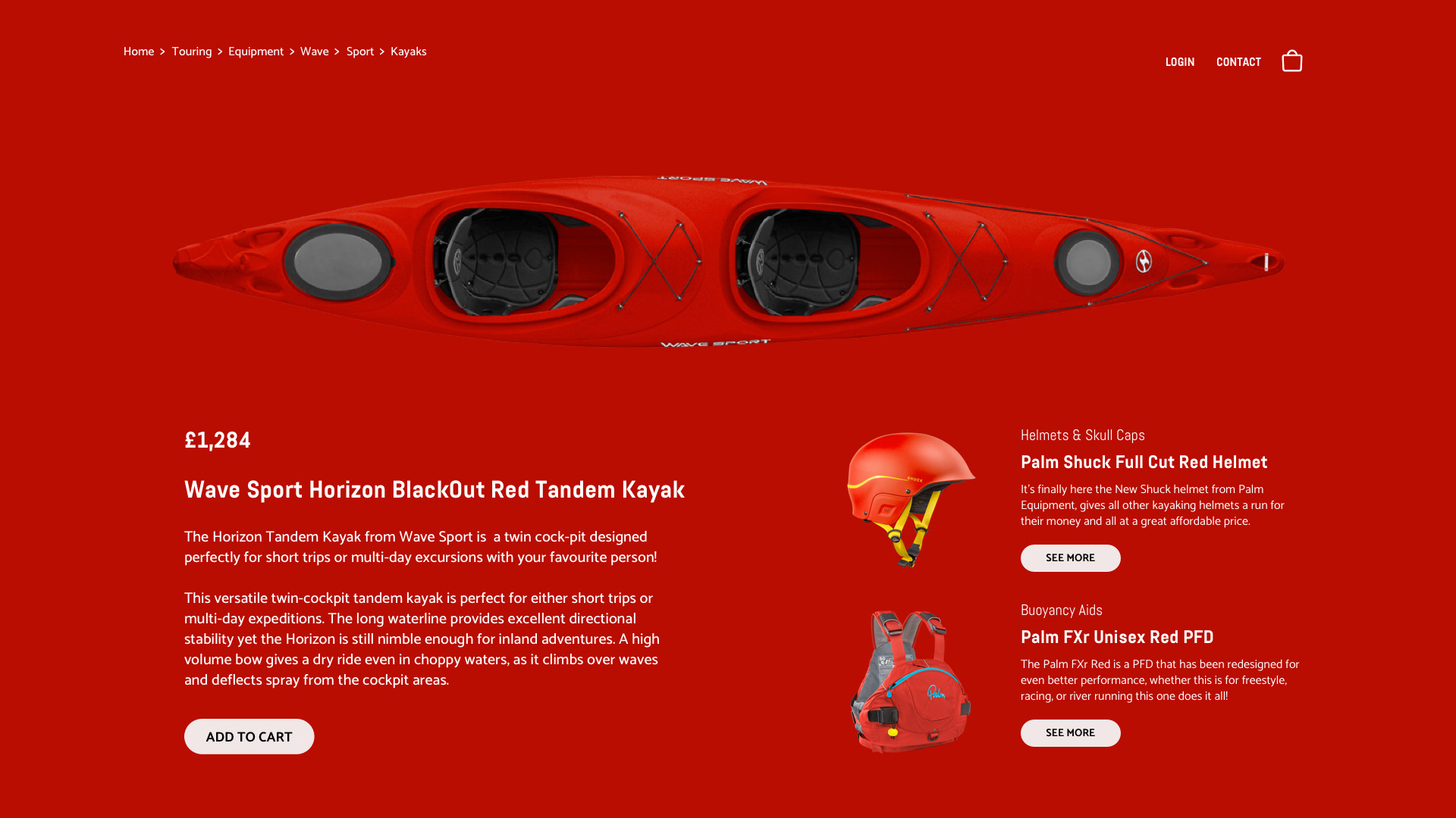
Wave Sports is a brand specialising in kayaks and water sport accessories. We live kayaking…eat, sleep and breathe it. Kayaking in the most extreme forms known to man. Kayaking that releases our frantic minds from what's happening back on land. We travel the globe searching for new drops, new waves, and new experiences. For us and for our extended family of Wave Sports customers, kayaking isn't just a destination. It's about the journey. We cherish memories of the journey and the relationships founded on our common goal (and sometimes common struggle). We push, pull, bend and break ourselves to bring you the best performing kayaks on the planet….and we always manage to have some fun along the way. We teach, we learn, and we love to ignite the same passion that we feel for paddle sports in others. We live a liquid lifestyle. We dream about. We are Wave Sport.
This is part of a series of personal projects that explore quick ideation. Each piece of this series has been done in less than four hours and delivers one visual using 3 main colours. With this practice I don't pretend to deliver a final visual, the main goal is to explore my creative taste and train myself to think and paint my thoughts quickly.
Project Goals
My challenge for this piece was to use a bold colour as a background and try to balance different elements without clashing with each other.


Conclusions
In a product page, your goal is to focus on the product, if this is the case, the bold colour will take away from your main goal. Also, don't forget about the hierarchy when you are placing more elements. Use your typography wisely to bring hierarchy.