BURBERRY
Email Redesign, Design System and Framework Development.
Automating a design system and how to adapt your framework.
Burberry is British luxury fashion house headquartered in London, England. It is best known for designing ready to wear, most notably its trench coats, however also leather goods, footwear, fashion accessories, eyewear, fragrances and cosmetics. Over the years, Burberry has increased its digital online presence and relies heavily on online communications.
I joined the Burberry Digital Design Team in January 2019 with the specific mission to improve the results of online marketing campaigns and to develop a new framework in this area.
The Problem
Historically, Burberry used to send out 20 email campaigns per month. Each of these were designed and developed like brand new projects, even if the design of each campaign was similar to the one prior. This process was extremely time consuming and repetitive, making it challenging to meet deadlines.
Project Goals
Fast Delivery: It became clear that the teams were copying and pasting copy, next looking for assets, then going back and forth to approve those assets. I realised we needed to find a tool that would allow us to pull content from a text document into the design.
Strategy: We had to allow marketing to plan the brand strategy in advance and gain enough time to apply this strategy into the campaigns before a new collection launch or brand moment.
Consistency: We required consistency, especially with the rest of the brand. Also, to be able to update existing components quickly, or incorporate new components to our campaigns.
Increase Metrics: The team metrics decreased over several months and so we had to find an effective solution to improve these metrics and contribute to an overall growth of the brand.
Exploration
Naturally, there were varying ideas about what the solution should look like, and how we could execute our campaigns faster and more consistently - whilst at the same time increasing our metrics. I explored everything, feeding back regularly to both colleagues and key stakeholders alike.
One idea we explored was the creation of a template system that would allow quick interaction in between teams and fast campaigns iterations.
Narrowing Focus
A design system allows you to centralise your source of information and create reusable components with the ability to customise them. It also: saves time on your processes; ensures UX and UI consistency; reduces cost across different teams; increases and promotes innovation; enables collaboration; and speeds up iterations and updates.
Usability Test
Before finalising the framework base in a design system, I wanted to see how our teams would respond to our chosen direction. We conducted a usability test to observe how teams interacted with this prototype. Our goal was not to see if our users would complete a set task as quickly as possible, but rather to gauge general interest and intrigue in the system, and to discover which parts they found the most value in.
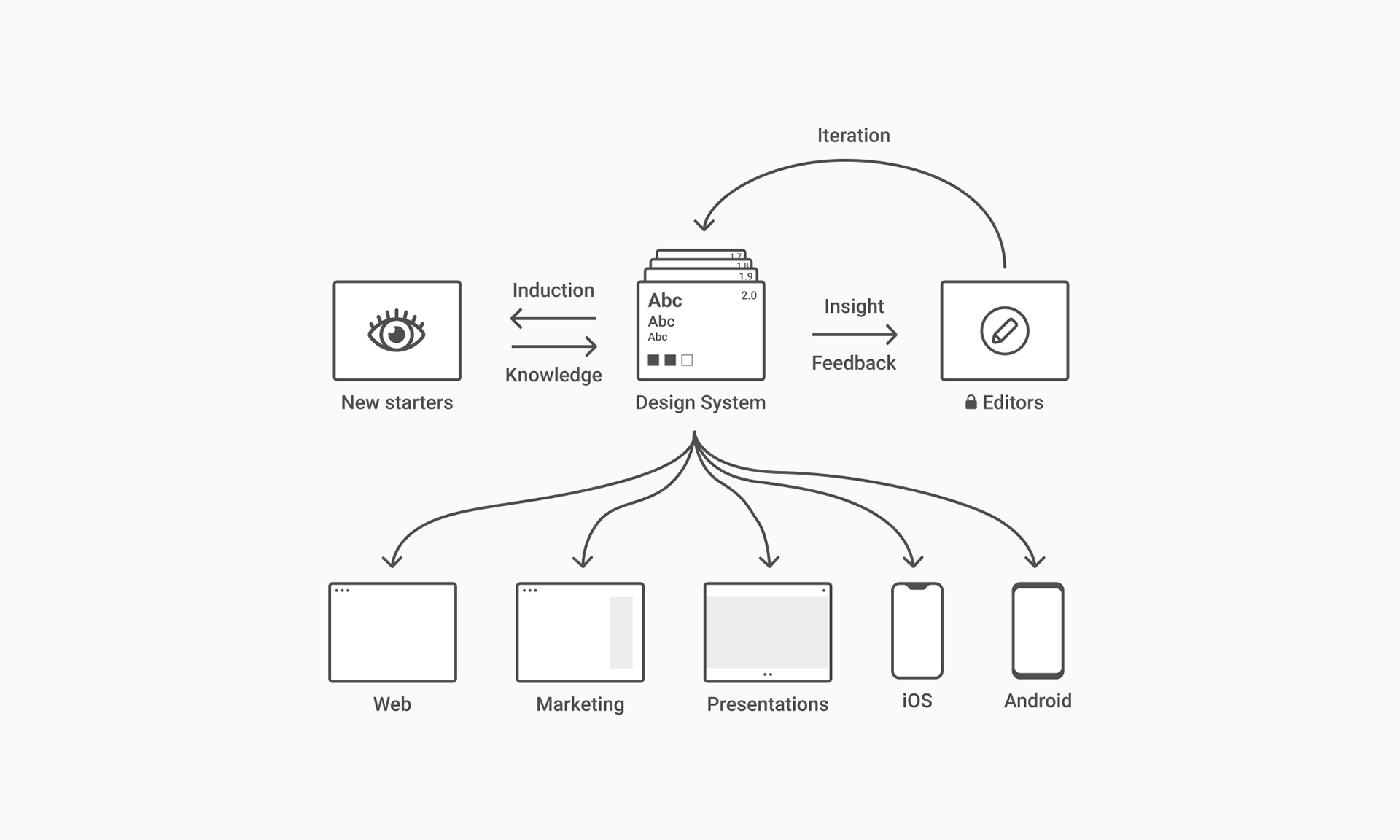
Creating a Framework based on an Automated Design System
After validating our direction, there were still many details I had to finalise before our team of developers could start building the system. In our usability test, we saw that many participants did not know how the entire system was related, as each team saw two parts of the framework at a time. I also needed to develop the design system and incorporate the plug-ins while documenting the components. Then I created a user guide for the teams to understand the entire system and arranged a series of workshops as the framework progressed.
Final Deliverables
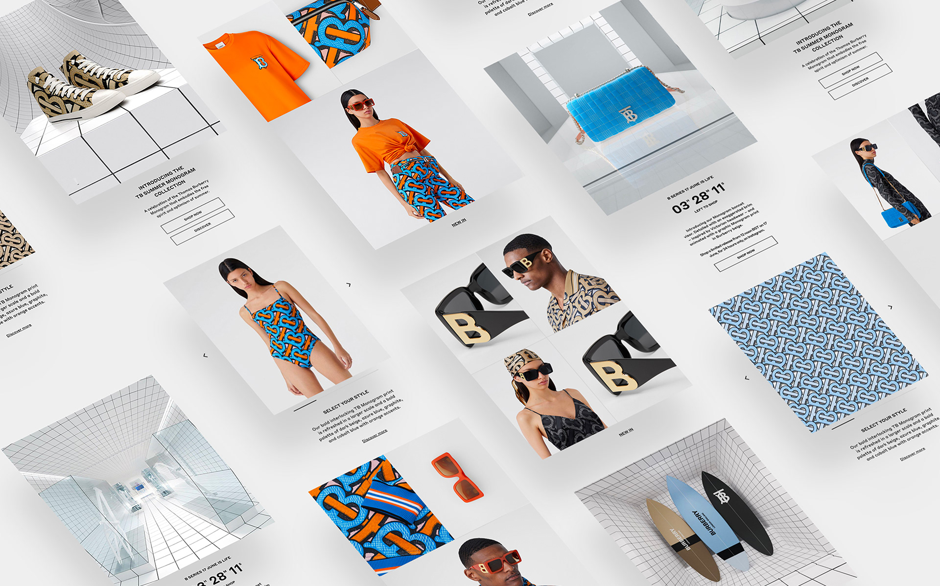
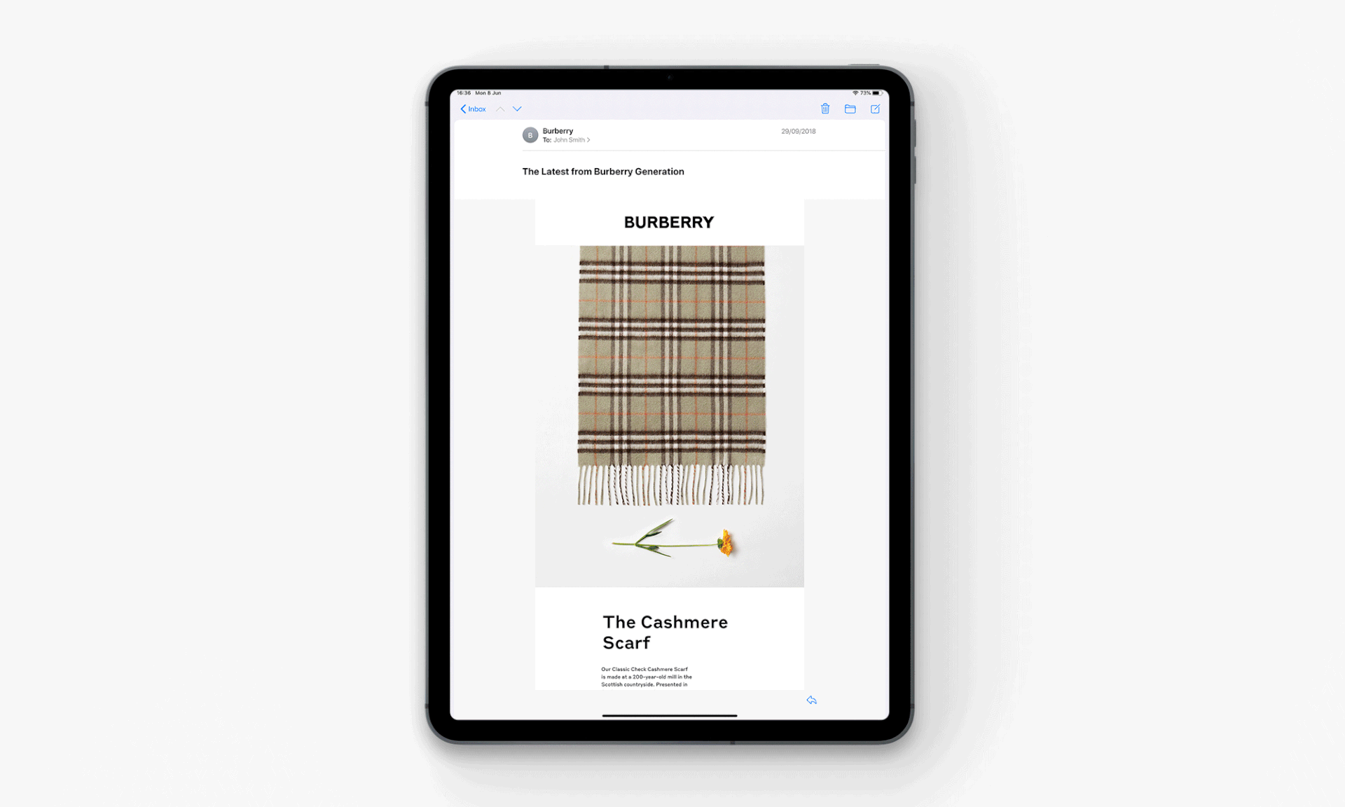
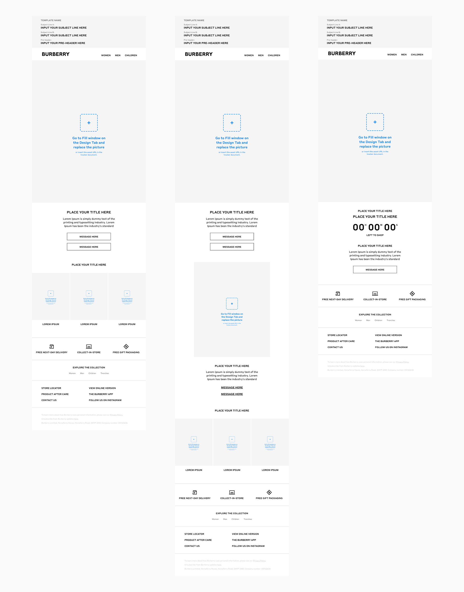
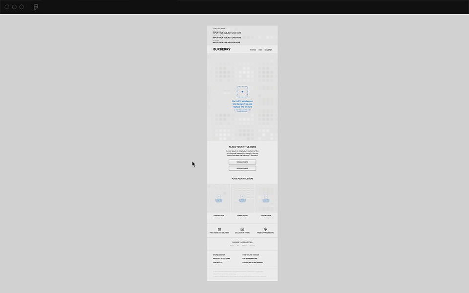
Email Redesign: Alongside building the system, we created a fresh look and feel to the email campaigns. We reduced the width of the emails and shifted the focus onto the visuals, as well as refining the typography styles. Additionally, we wanted to engage the customer through reducing the number of messages per campaign, thus giving the main message centre-stage.
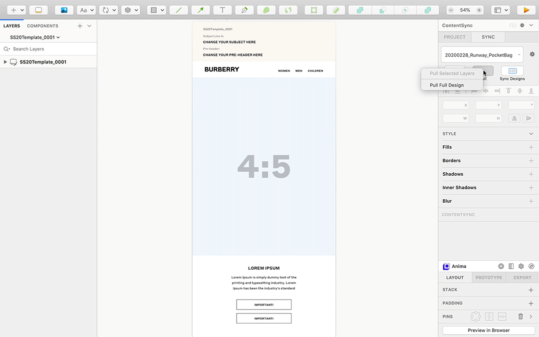
Figma File Structure: Allows designers to deliver campaigns faster while maintaining the system. Plus, the library structure is easier and more accessible to everyone.
Plug-ins Architecture: By combining different Figma plug-ins, we allowed templates to autofill the campaign copy and assets while they auto-layout depending on the content. Also, if we made any copy update in Figma, teams could feed back on copy documents.
Google Spreadsheet: A structured system which allowed the copy team to complete information and track campaigns easily.
Asana Flow: Having all the campaigns online with Figma allowed Project managers to track them using internal urls. This also allowed them to go in viewer mode if they needed.
Result and Next Steps
The teams at Burberry adopted the design system and workflow within a week. Now, the design system and the workflow have been used for a year and a half by all the teams. After testing the framework we identified issues that could work better in another way, components which didn’t sync properly, etc. We worked constantly towards improvement through different iterations.
As a result, we managed to double the number of campaigns we delivered per month (more campaigns = lower absolute KPI metrics). We increased email metrics month on month, even surpassing previous years.
Learnings
This project was a huge endeavour, and the amount of teams involved was unlike anything I or even my colleagues had been used to. Here are a few takeaways I got from working as the only designer on this project:
Take what users say with a grain of salt: Qualitative research isn’t always going to get you the answers you want to hear. Especially when it’s generative research, the answers you get may be a jumbled mess that won’t always point you in a clear direction. In our case, the teams we interviewed didn’t see an inherent problem in the way they were working, but we saw within their workflow and metrics an opportunity to make something that promoted better results.
Good products don’t always solve an obvious (or the original) problem: That might be a little controversial since “design thinking” is always taught as “solving problems.” I’m sure the most efficient way to build a product that sells is to find a need and fill it, but what about products like Facebook? Snapchat? One of the biggest things I learned whilst working on this project was to trust my intuition for ideas that seemed interesting, while at the same time making sure that I was the one using the right words to articulate hard-to-grasp feelings beyond “cool” or “awesome.”
Involve different teams early on: I regret not speaking to other teams sooner, and not pushing my PMs harder to get everyone involved earlier on. If they were able to see what we were thinking during the ideation process, we would have been better equipped to eliminate some ideas early on.
Learn more about the project.
Automating your design system and how to adapt your workflow — a case study
Roberto Herrera Jun 19 · 12 min read
UX Collective. Curated stories on user experience, visual, and product design.
Roberto Herrera Jun 19 · 12 min read
UX Collective. Curated stories on user experience, visual, and product design.